US “Educational” Notes of 1896
“Educational Series” is the informal name used by numismatists to refer to a series of United States silver certificates produced by the U.S. Treasury in 1896, after its Bureau of Engraving and Printing chief Claude M. Johnson ordered a new currency design. The notes depict various allegorical motifs and are considered by some[numismatists to be the most beautiful monetary designs ever produced by the United States.[1]
One Dollar
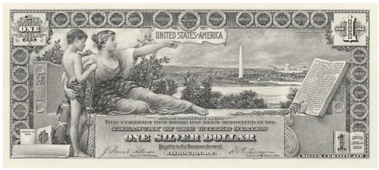
$1 1896 SILVER CERTIFICATE OBVERSE
Will H. Low was the designer of the $1 and his painting was entitled “History Instructing Youth”. The Constitution is seen at the right, while the Washington Monument and the Capitol are in the distance. Low’s design was approved on May 10, 1894 and the completed design was accepted on July 10, 1894. Morris redesigned the borders and the lettering, but the print run didn’t start until April 18, 1896. The New York Times ran an article discussing a possible error on the note[2]. On the note the spelling of the word ‘tranquility’ (which can be found on the left side of the Constitution lines 10 and 11) was wrong. It should have two “l’s” instead of the one. As it turns out, a friend of G.F.C. Smillie (Chief Engraver) already notified him of this so-called mistake. Once this article hit the newsstands, the perceived error was already trading for a 10- to 25-cent premium.
However, all this was for naught. The spelling is indeed correct as it was acceptable to spell ‘tranquility’ with one “l” during the time of the writing of the Constitution. Charles Schlecht conducted the engraving on the front of the note.
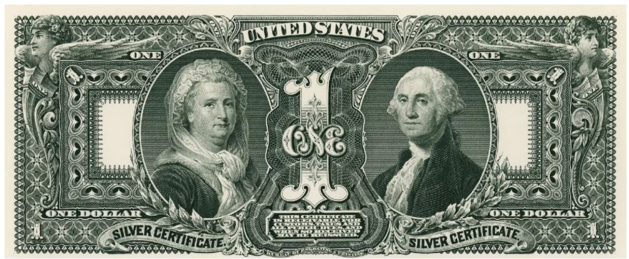
$1 1896 SILVER CERTIFICATE REVERSE
The back features winged liberty with a shield at the top left and right corners, Martha Washington on the left and George Washington on the right. A large numeral “1” sits firmly in the center between the first family. Morris was the lead designer of the back; however, Charles Burt engraved the Martha vignette (in 1878), and Alfred Sealey engraved the George vignette (in 1867)[3]. The remaining parts of the note were engraved by five other engravers: L.F. Ellis, James Kennedy, D.S. Ronaldson, G.U. Rose, Jr., and E.M. Hall.
However, the general public didn’t approve of how the back of the note was set up. They complained saying “no one should come between George and Martha Washington.” The first family was so revered that it was an insult to place a large “1” as the centerpiece of the note.
Two Dollars
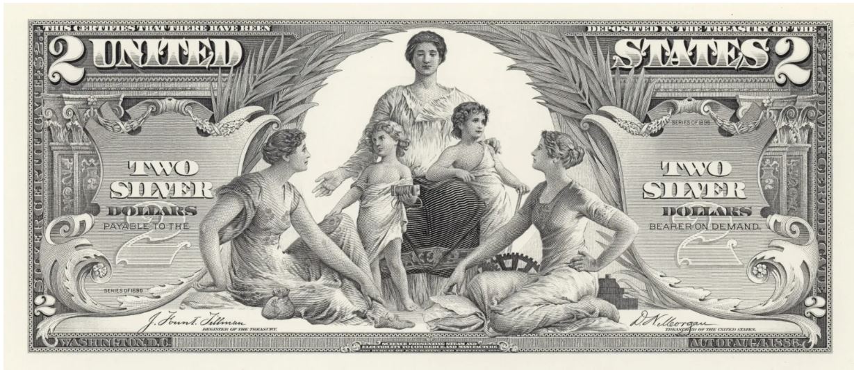
$2 1896 Silver Certificate
The question Bureau Chief Johnson needed to answer was who was going to design for the upcoming $2 note. He found his answer in Edwin H. Blashfield. There was one problem. Blashfield did not have a design for the $2; his design was for a $50. Much like Low, Blashfield did not approve of Johnson’s changes. Blashfield stated, in a letter to Johnson, that he would be fine with it as a $10 or a $20 anything besides a single digit number. He went on to say that he structured the design of “Science presenting steam and electricity to Commerce and Manufacture” in a pyramid and two could not hold the same compositional effect as a 50 can. Needless to say, Johnson won this argument and Blashfield made the required changes in order to appease his boss.
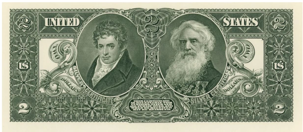
Lorenzo Hatch engraved both the portraits of Robert Fulton (inventor of the commercial steamboat) and Samuel F.B. Morse (the inventor of the telegraph). These portraits are the focal points on the back of the note, and create a perfect circle with the allegory on the front. As with the $1, Thomas F. Morris was the rear back designer as well as the central frame and background designer on the front of the note.
Five Dollars
$5 1896 Silver Certificate,
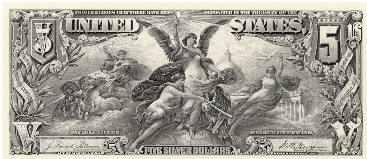
That leaves us with the $5 silver certificate “Electricity as the Dominant Force in the World” designed by Walter Shirlaw, an engraver, painter, and muralist. At the center of this gorgeous note is a winged female (Electricity) holding a light bulb. To her right is Jupiter riding in on a chariot while holding a lightning bolt that is energizing the light bulb. Next is Fame with a trumpet delivering sweet music over a map of the United States. To her right is a bald eagle standing guard of America and Washington D.C. (which can be seen in the background). Finally, to Electricity’s far right is Peace along with her dove – always the symbol of peace.
Thomas F. Morris persuaded Johnson to change the scrollwork around the border of the note and is credited for changing these elements. Shirlaw originally had blank shields at the left and right borders. Morris added the plant life surrounding the phrases seen on the left and right-hand side. G.F.C. Smillie engraved the front of the $5 note.
As with the $1 before it, there was some public criticism of these notes. Most obviously was the bare-chested Electricity. Several groups wrote letters to Johnson urging him to clothe her in future versions of the note. Bank tellers also complained saying that it was hard to count at a fast pace – due to the denominations not being at the top corners. Another issue was after much handling the notes became smeared and hard to read and the notes also looked fake. These complaints were fixed by making the numbers clearer and adding lathe work to the corners.[3]
At one point there were plans to design and make higher denominations ($10, $20, etc) but there was a changing of the guard. In 1897 a new Secretary was placed into office – Lyman J. Gage. Gage was not a fan of the Educational Series and went on record numerous times saying that all future notes would not be designed by painters and that they would be practically identical, simple, clear, and straightforward in all of their designs. This was the end of powerful panoramic views on banknotes.
This short-lived series may have only been in circulation for a few years, but it certainly has not left our hearts and our minds as some of the most artistic designs ever to grace a U.S. banknote.